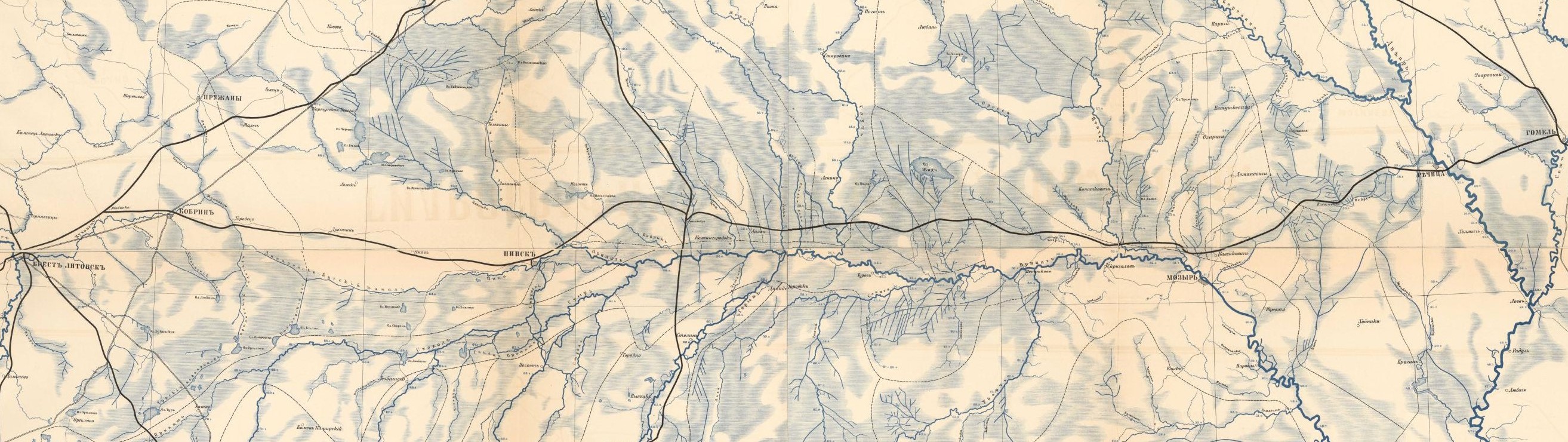
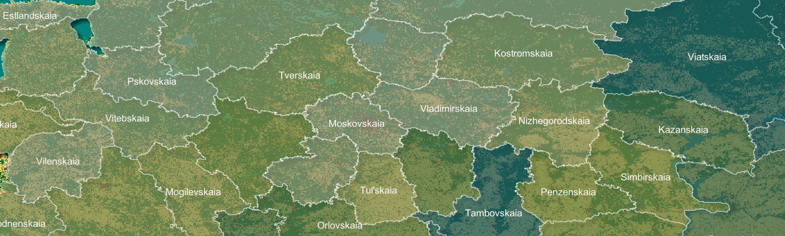
| content | sioc:content | We can't intervene in the past. But we can interact with it.This is one of the most compelling reasons to "do" digital history: suddenly, the historical record feels like a playground or a garden full of warm, rich, soil. You can almost reach out and touch it.
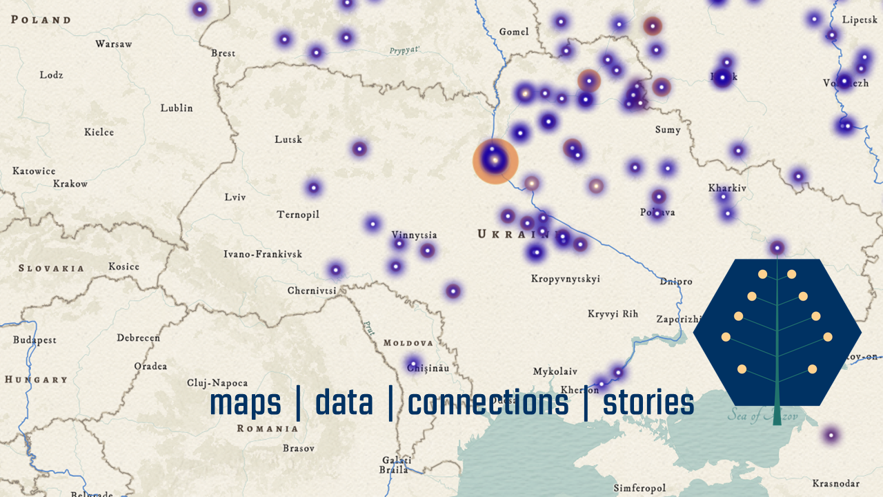
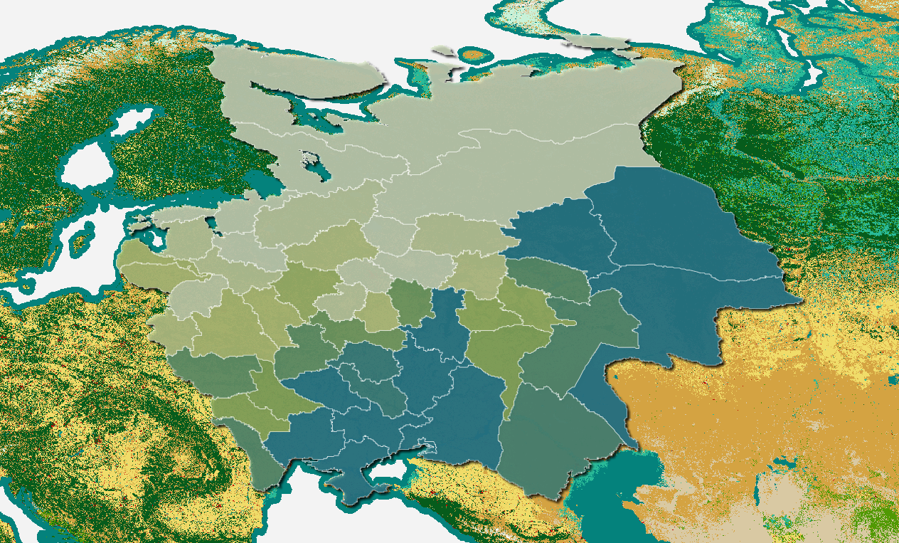
And if you can't actually touch it, you should at least be able to see it. That is where dashboards come in. A dashboard is a set of interconnected visualizations: maps, bar charts, strange and wonderful arrangements of dots, you name it. The idea is that when we publish a dataset, we build a dashboard that makes it easier to see the idiosyncrasies and patterns. Rather than present a linear story, a dashboard encourages you to explore content, generate questions, and maybe even generate together a new piece of (data-driven) history.
You can't break anything, and if something goes wrong along the way, just refresh your browser and dive back in. |
_Russian_style_1911_original.jpg)