The Imperiia ProjectMain MenuResearch Dashboardsmaps, visualizations, and moreVeles: The Data CatalogOngoing ProjectsThe MapMaker PodcastEvery story starts somewhere.Teach with MapsGalleriesKelly O'Neilldc20b45f1d74122ba0d654d19961d826c5a557f5The Imperiia Project // Davis Center for Russian and Eurasian Studies, Harvard University
Map of the Week Gallery
12026-02-19T12:59:49-05:00Paul Vadanf46fd2a7a6d2ab1ecca0ec13c84118eaf61facfa945structured_gallery2026-05-19T13:32:54-04:00Anastasiia Pereverten1dee3aa5075817eb04077dbae88a1030d7d4ebb4Our Map of the Week project delivers a weekly email to subscribers. In each "issue" we spotlight a map - either Imperiia-built or historic - that offers unique insight into the daily life of the Russian Empire. Sign up here!
Click any image to read the text that accompanied the map.
Contents of this path:
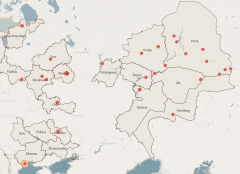
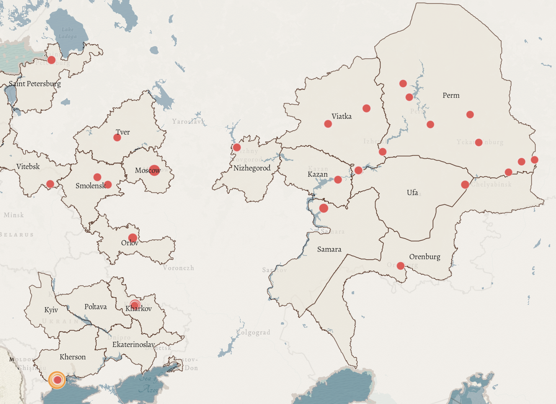
12026-02-19T15:50:57-05:00Anastasiia Pereverten1dee3aa5075817eb04077dbae88a1030d7d4ebb4The Economic Geography of Sweets2We began our investigation of the economic geography of the Russian Empire with the confection industry. We mapped 162 factories across 41 towns. They employed over 5,000 workers and produced more than 11,000 tons of confections – worth over 10 million rubles – each year. Every sweet had its own geography. Here is a map of gingerbread (red) and halva (orange) production. The distribution of factories is of two patterns: while gingerbread production was widespread, halva was mostly produced around Odesa. [issue date: 13 November 2025]plain2026-02-26T11:56:27-05:00Kelly O'Neilldc20b45f1d74122ba0d654d19961d826c5a557f5
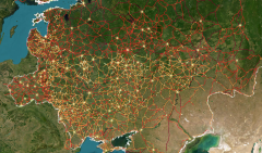
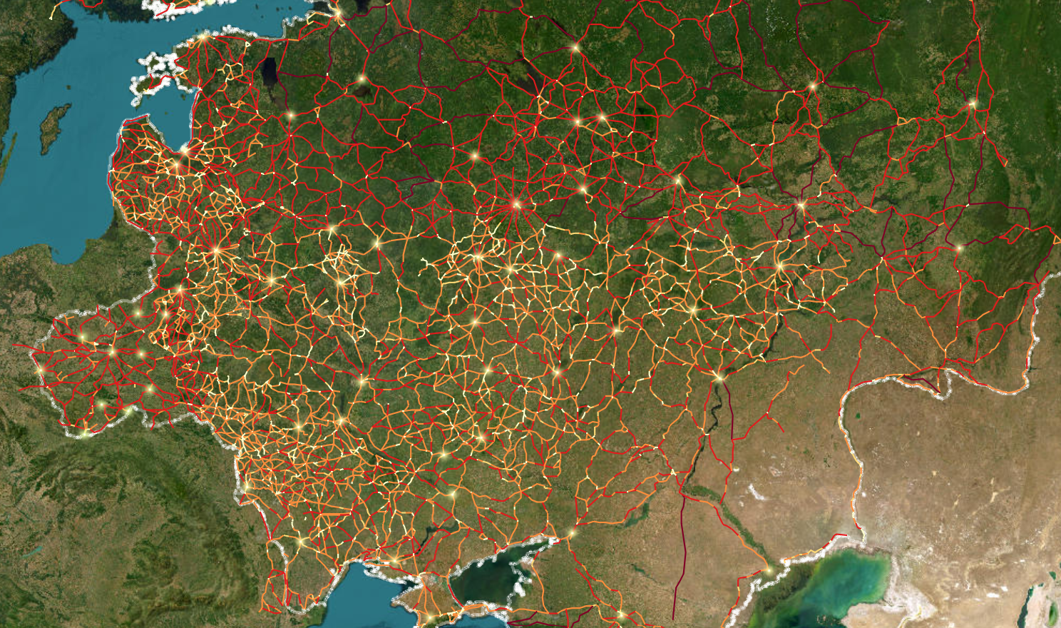
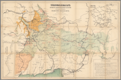
12026-02-19T15:50:05-05:00Anastasiia Pereverten1dee3aa5075817eb04077dbae88a1030d7d4ebb4Early 19th Century Roads1This map depicts the road network of the Russian Empire in the 1820s. The lines trace known routes connecting towns and villages across the “European” part of the country. The darker the line on the map, the greater the length of the road segment it represents.plain2026-02-19T15:50:05-05:00Anastasiia Pereverten1dee3aa5075817eb04077dbae88a1030d7d4ebb4
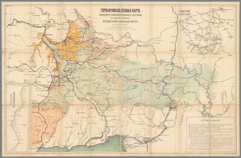
12026-02-19T15:49:18-05:00Anastasiia Pereverten1dee3aa5075817eb04077dbae88a1030d7d4ebb4Coal Mines of Eastern Ukraine1Every month or so we will sprinkle in a historic map. By the time this one was created, the Donets region had become the primary coal-producing area for the Russian Empire. The government invested in surveying resources as well as extracting them, and as a result we have this map of mineral deposits, railways and stations, and mines (in red). It is a beautiful example of chromolithography – a method of color printing using stones or metal plates to produce cheap, eye-catching, information-dense images. Interestingly enough, Vincent van Gogh, who died the year this map was published, used a similar palette in his depictions of the industrializing landscapes of France.plain2026-02-19T15:49:18-05:00Anastasiia Pereverten1dee3aa5075817eb04077dbae88a1030d7d4ebb4
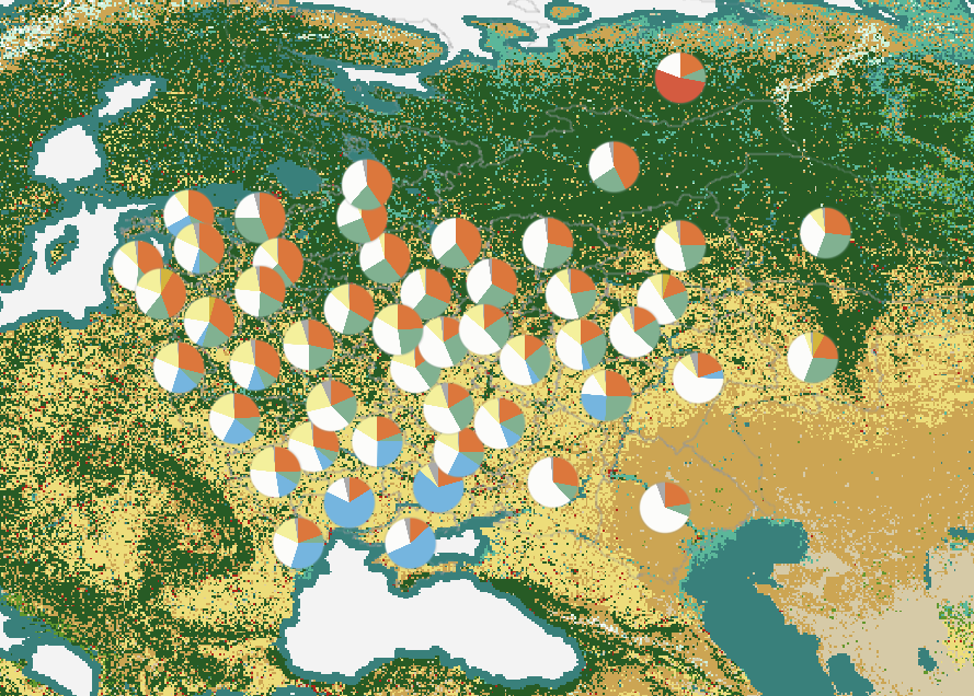
12026-02-19T15:48:21-05:00Anastasiia Pereverten1dee3aa5075817eb04077dbae88a1030d7d4ebb4Sheep, Reindeer, and Cattle2This week we are sharing a snapshot of animal populations across the western part of the Russian Empire. The map makes all sorts of claims. For example, the prominent fine-fleece sheep population (the blue piece of the pie) in southern Ukrainian provinces suggests a vibrant wool industry, while the prevalence of reindeer (the red piece of the pie) in the far north suggests adaptation to harsh climates. But just how much can we learn from an animal census? Are livestock counts reliable indicators of economic life? And are we better off paying attention to the outliers or the ordinary - the camels or the cattle - if we want to understand differences across the regions?plain2026-02-19T15:48:35-05:00Anastasiia Pereverten1dee3aa5075817eb04077dbae88a1030d7d4ebb4
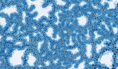
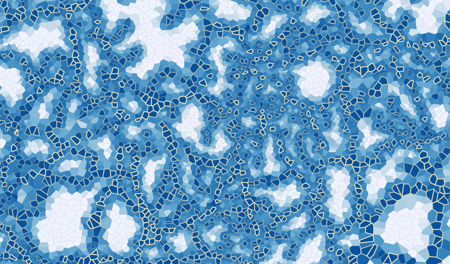
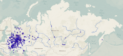
12026-02-19T15:47:46-05:00Anastasiia Pereverten1dee3aa5075817eb04077dbae88a1030d7d4ebb4An Exercise in Reimagining Space1What if we set aside what we knew about how the Russian Empire looked? What if we erased the boundaries and roads, and imagined it instead as a continuous space? This week we are back to playing with data from the Geographical Atlas of the Russian Empire produced in the 1820s. We found the midlines between the 12,203 settlements shown there and used those shapes as the base layer. Then we calculated the distance from each of those spaces to the nearest post station. Why? Because a post station was a meaningful connection to a broad network of mobility: of goods and people and animals and news. As you can see, the clustering pattern varies constantly, whispering suggestions about population density, topography, and routes. The story lines aren’t always clear. They challenge our idea of what we know and what is familiar. They leave a lot to the imagination. And maybe that’s just what we all need as we head into a new year.plain2026-02-19T15:47:46-05:00Anastasiia Pereverten1dee3aa5075817eb04077dbae88a1030d7d4ebb4
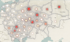
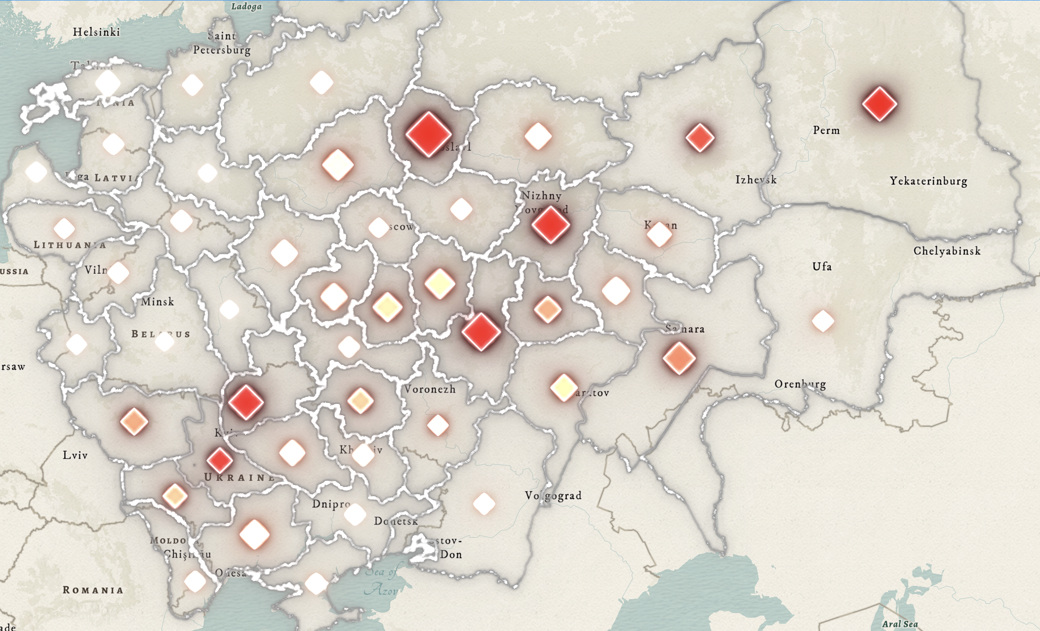
12026-02-19T15:46:51-05:00Anastasiia Pereverten1dee3aa5075817eb04077dbae88a1030d7d4ebb4Fire, Reform, and Unrest1We are back from winter break with a new set of interactive maps. In the "Up in Flames” project, we mapped arson incidents in the Russian Empire during the turbulent years surrounding the Emancipation of the Serfs. The map above focuses on 1862, the year after serfdom was abolished. The interactive map linked below aggregates 3,128 recorded arson incidents across 49 provinces between 1860 and 1864, showing both where arson was most concentrated and where it made up a larger share of all fires. By stepping through the years, you can trace shifting geographies of unrest across the Russian Empire.plain2026-02-19T15:46:51-05:00Anastasiia Pereverten1dee3aa5075817eb04077dbae88a1030d7d4ebb4
12026-02-19T15:45:20-05:00Anastasiia Pereverten1dee3aa5075817eb04077dbae88a1030d7d4ebb4Orthodox Monasteries and Rivers in 18171Maps can tell us surprisingly intimate things. They also have a knack for drawing attention to outliers. This map does both. It visualizes the distribution of over 500 Orthodox monasteries across the Russian Empire in 1817. Many are concentrated near imperial centers in the European part of the empire, but others could hardly be more remote, sitting on the peripheries and sometimes even on islands. The map wants us to notice that most secluded monasteries were situated along major rivers or other bodies of water. It wants us to remember that monasteries were not only sites of prayer and pilgrimage but also important hubs of agriculture, industry, and trade. Click through to the interactive to add data layers: relic sites, provincial towns and boundaries, post roads, and lakes. We leave it to you to imagine the life that took place within the walls.plain2026-02-19T15:45:20-05:00Anastasiia Pereverten1dee3aa5075817eb04077dbae88a1030d7d4ebb4
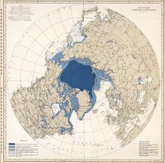
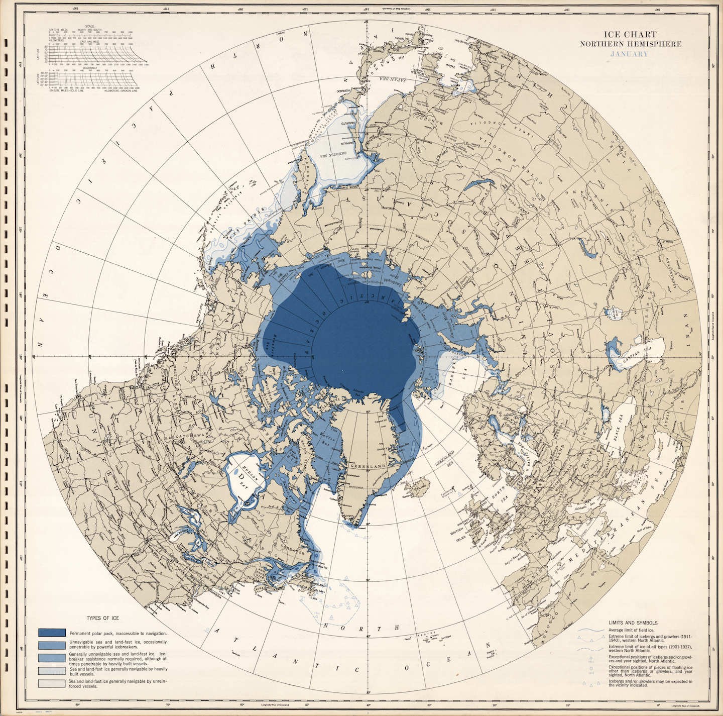
12026-02-19T15:26:04-05:00Anastasiia Pereverten1dee3aa5075817eb04077dbae88a1030d7d4ebb4Cold Snap1As the end of the month approaches, we are leaning into winter with a selection from the David Rumsey Historical Map Collection. This ice chart of the Northern Hemisphere takes us back to January 1946. Produced by the U.S. Navy’s Hydrographic Office, it reflects growing interest in polar regions, shipping routes, and risks to navigation. Look carefully and you will see that the chart distinguishes permanent polar packs from areas of sea ice navigable by unreinforced vessels, translating environmental conditions into operational knowledge. But even if you aren’t planning to travel back in time to sail the North Atlantic, you might be curious about the known limits of icebergs and growlers. Enjoy!plain2026-02-19T15:26:04-05:00Anastasiia Pereverten1dee3aa5075817eb04077dbae88a1030d7d4ebb4
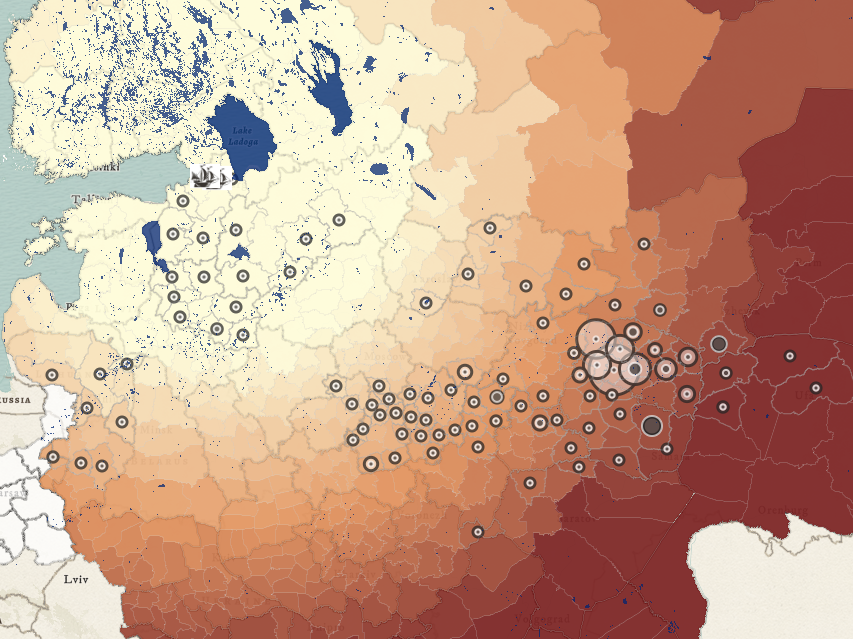
12026-02-19T15:44:39-05:00Anastasiia Pereverten1dee3aa5075817eb04077dbae88a1030d7d4ebb4Oaks and Naval Expansion1At the turn of the 18th century, Peter I declared that his land-based empire would become a naval power. This map gives us a sense of the difficulty of that task. It shows us where the Baltic Fleet had to go (in 1806) to acquire the oak trees necessary for building ship hulls. The number of mature trees ready to be felled at each location is represented by a small dot surrounded by a larger dot representing the total number of trees present. Meanwhile, the color gradient tells us how far each oak grove was from the fleet's shipyards (the darker the color, the greater the distance). Now, imagine yourself the admiral tasked with producing ships-of-the-line just as the Napoleonic Wars were getting underway. What would you do? How would you transport precious oaks as much as 700 miles to the Baltic coast? Use our map to study the Russian Empire’s drive for naval power as an environmental and logistical project. Add layers, take measurements, and compare the Baltic and Black Sea fleet geographies.plain2026-02-19T15:44:39-05:00Anastasiia Pereverten1dee3aa5075817eb04077dbae88a1030d7d4ebb4
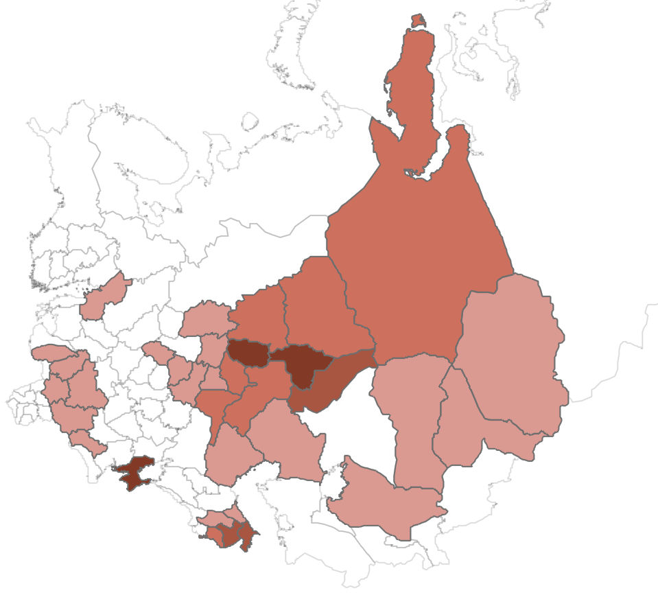
12026-02-19T15:29:25-05:00Anastasiia Pereverten1dee3aa5075817eb04077dbae88a1030d7d4ebb4Distribution of Mosques c.18801In 1886 the Ministry of Internal Affairs - the Department of Spiritual Affairs of Foreign Faiths, to be specific - published a mosque census listing 6,307 mosques distributed across 34 provinces. This map transforms that list into a map. It visualizes the percentage of the empire’s total number of mosques located within each province, with provinces containing none shown in white and darker shades indicating higher concentrations. The most significant concentrations appear in the Volga-Ural region, Tavrida (including Crimea) and the Caucasus. But is this the whole story? How did imperial officials go about counting mosques? Can we trust the picture generated by their data?plain2026-02-19T15:29:25-05:00Anastasiia Pereverten1dee3aa5075817eb04077dbae88a1030d7d4ebb4
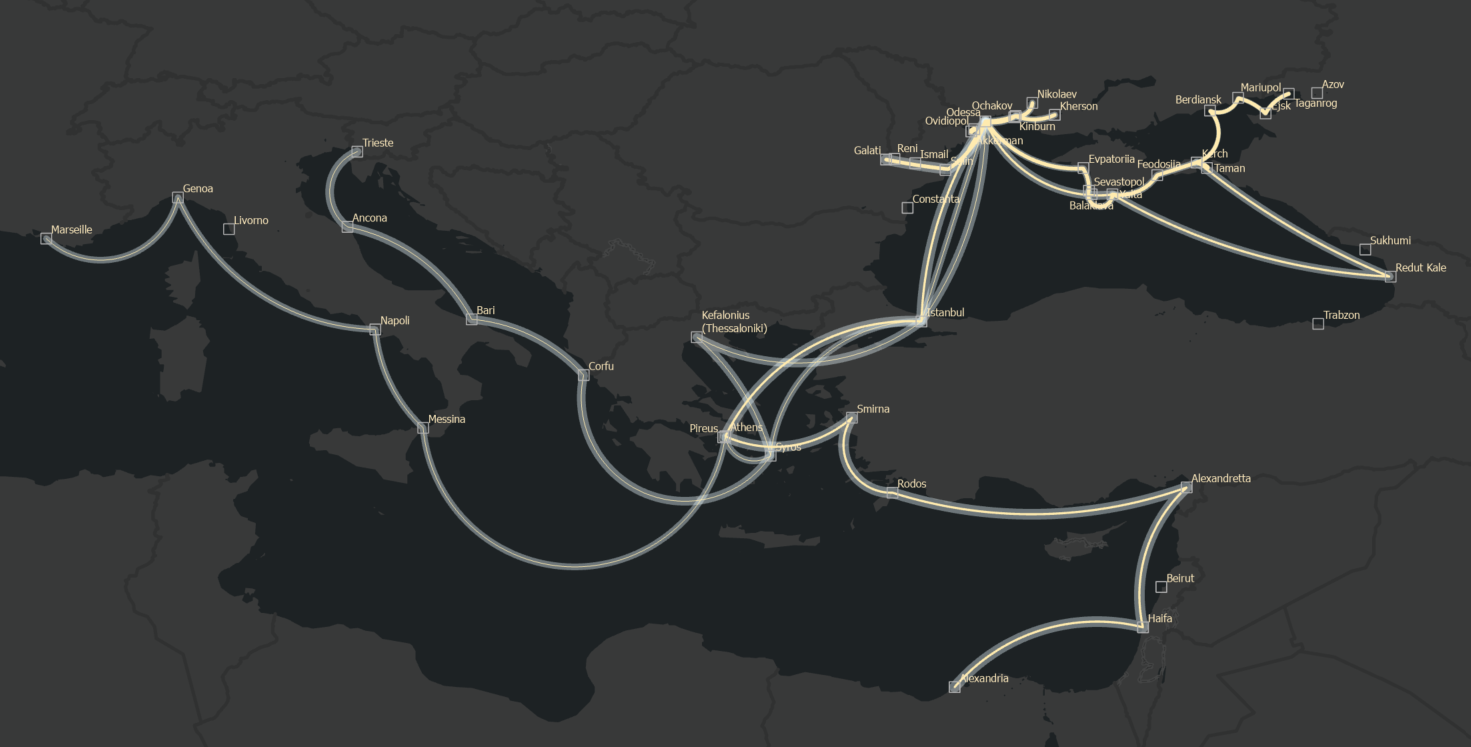
12026-02-27T13:21:29-05:00Anastasiia Pereverten1dee3aa5075817eb04077dbae88a1030d7d4ebb4Black Sea Steamship Company Voyage Map1In 1856, the Treaty of Paris required Russia to remove its fleet and naval installations from the Black Sea. But as the saying goes, when a door closes, a window opens: that same year, the tsarist government approved the charter for the Black Sea Steamship Company. This civilian enterprise would sail throughout the Black and Mediterranean seas. The thicker the yellow line, the greater the number of scheduled voyages along a given route. The wider the transparent underlayer, the greater the government subsidy (measured in rubles per mile). As you can see, each route represents a different mixture of (imperial) ambition and (consumer) demand.plain2026-02-27T13:21:29-05:00Anastasiia Pereverten1dee3aa5075817eb04077dbae88a1030d7d4ebb4
12026-03-12T15:01:05-04:00Anastasiia Pereverten1dee3aa5075817eb04077dbae88a1030d7d4ebb41837 Mykolaiv City Plan1This plan of Mykolaiv is an Imperiia Project favorite. It shows the urban fabric of a Black Sea port city as it was in 1837. Vineyards, meat shops, barracks, market squares - they are all here, interspersed with Orthodox, Catholic, and Old Believer churches, an Armenian cathedral, and a Jewish synagogue. You can imagine the bustle and the currents of conversation in a dozen languages. But this week we want to draw your attention to the map itself as much as the place it represents. This map has a story to tell about those who make maps and those who treasure them. Most of all, it is a story that reminds us what is at stake when bombs threaten archives, libraries, and museums.plain2026-03-12T15:01:05-04:00Anastasiia Pereverten1dee3aa5075817eb04077dbae88a1030d7d4ebb4
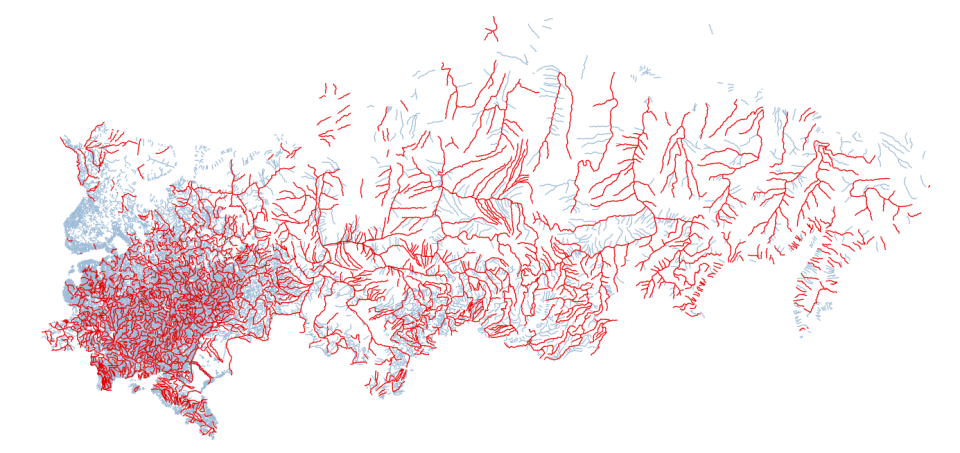
12026-03-13T14:36:30-04:00Anastasiia Pereverten1dee3aa5075817eb04077dbae88a1030d7d4ebb4Rivers of the Russian Empire 1827 (GARE)1Rivers were the lifeline of the Russian Empire and they are a core feature of the landmark Geographic Atlas of the Russian Empire, the Kingdom of Poland, and the Grand Duchy of Finland (1827). Over the past few months, Imperiia Project Innovation Fellow Anastasiia Pereverten meticulously recorded the names, which are given in both Slavic and Latin scripts, of all labeled rivers across 59 map sheets (see the red lines). The blue lines depict rivers left unnamed in the atlas. The extraction process took 40 hours, involved transcribing Cyrillic and Latin names, and reminded our whole team of the value of human expertise and creative problem-solving. Ana’s work opens up new possibilities for research in hydrography, environmental history, and imperial knowledge production. Stay tuned for the publication of the full dataset!plain2026-03-13T14:36:30-04:00Anastasiia Pereverten1dee3aa5075817eb04077dbae88a1030d7d4ebb4
12026-04-09T12:12:22-04:00Anastasiia Pereverten1dee3aa5075817eb04077dbae88a1030d7d4ebb4Butter, fish, and the rivers that carried them1Rivers are our spring theme! This week we are looking at the rivers that carried the greatest portion (measured in rubles) of the trade in butter (orange) and fish (yellow) in the middle of the 19th century. These dietary staples are all over the historical record: in collections of tsarist legislation, travel accounts, Orthodox fasting guidelines, recipe books, trade statistics (like those we used to generate this map), etc. You could find them nearly everywhere in the empire itself, too. But as this map suggests, the geographies of trade in butter and fish were not the same. Look beyond the Volga and Don rivers and you will see what we mean.plain2026-04-09T12:12:22-04:00Anastasiia Pereverten1dee3aa5075817eb04077dbae88a1030d7d4ebb4
12026-04-09T12:09:37-04:00Anastasiia Pereverten1dee3aa5075817eb04077dbae88a1030d7d4ebb4Data visualization has history!1This week we are sharing a page from the first Austrian atlas of the world... In 1795, Franz Johann Joseph von Reilly made this statistical diagram presenting European states as nested rectangles organized by two variables: total land area and population density. Geography has been stripped away entirely. North, south, and even adjacency mean nothing here. What remains is comparison. “European Russia” draws immediate attention. Its rectangle (i.e., its land area) is the largest on the page, yet its position in the population density sits toward the sparse end of the scale. Poland appears with its own figures even though the Third Partition dissolved it as a sovereign state in the same year the atlas was published. Check out our analysis of the 230-year-old data visualization!plain2026-04-09T12:09:37-04:00Anastasiia Pereverten1dee3aa5075817eb04077dbae88a1030d7d4ebb4
12026-04-16T17:28:02-04:00Anastasiia Pereverten1dee3aa5075817eb04077dbae88a1030d7d4ebb4Fabled Gardens of Crimea1This week’s map brings you the fabled gardens of Crimea as they were at the turn of the 19th century. Glowing orange dots reveal apple orchards that were registered as state properties in the early years of Russian imperial rule. But there’s much more! As you explore the map and its many layers, you will discover a great variety of fruit trees as well as the celebrated Crimean vineyards - all 332 of them! For an added layer of analysis, compare their historical locations with the modern sites of orchards (yellow), vineyards (red), and the forests (green) across the Crimean mountains. You might even find yourself contemplating the anthropogenic impact on the landscape. So go ahead, tour the gardens!plain2026-04-16T17:28:02-04:00Anastasiia Pereverten1dee3aa5075817eb04077dbae88a1030d7d4ebb4
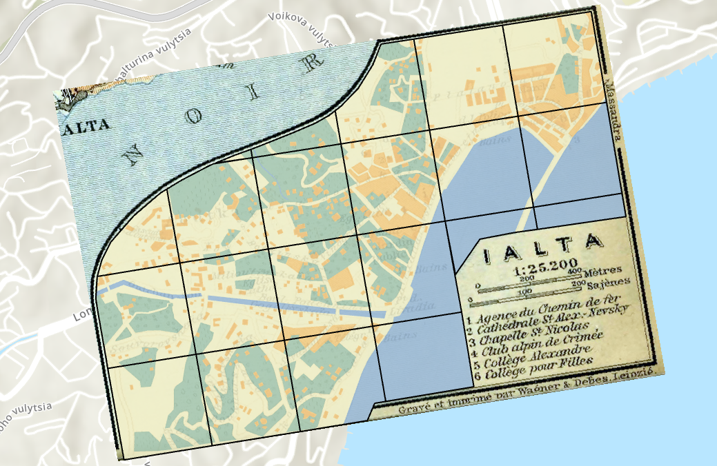
12026-04-23T17:20:24-04:00Anastasiia Pereverten1dee3aa5075817eb04077dbae88a1030d7d4ebb4Green, Water, and Stone — Yalta in 19142Every once in a while a 243rd anniversary gets overlooked, but we are out to change that. As of April 19 it has been 243 years since the Russian Empire first annexed Crimea. So, in an effort to keep the historical context of the current war in mind, this week's map brings us to Crimea - to Yalta, on the coast of the Black Sea. You are looking at a mashup: a vector analysis created in 2025 layered over a city plan published in 1914. The colors assign urban space to four categories: green for parks and gardens, orange for built structures, pale yellow for unbuilt land, and blue for water. The legend tells us this is a place with churches, schools, an alpine club, and a railway agency tying it to the rest of the empire. Yalta appears as a compact seaside town, and if you have heard of Yalta before, that won’t surprise you. But you probably haven’t seen it look quite like this. This unconventional view is part of a project - “Urban Space on the Edge of Revolution” - that compares 15 Finnish and Ukrainian towns. We georeferenced, vectorized, and raster-analyzed plans of each city to calculate the ratio of built and green space. We are building an interactive platform where you can explore these urban spaces. Stay tuned!plain2026-04-23T17:20:39-04:00Anastasiia Pereverten1dee3aa5075817eb04077dbae88a1030d7d4ebb4
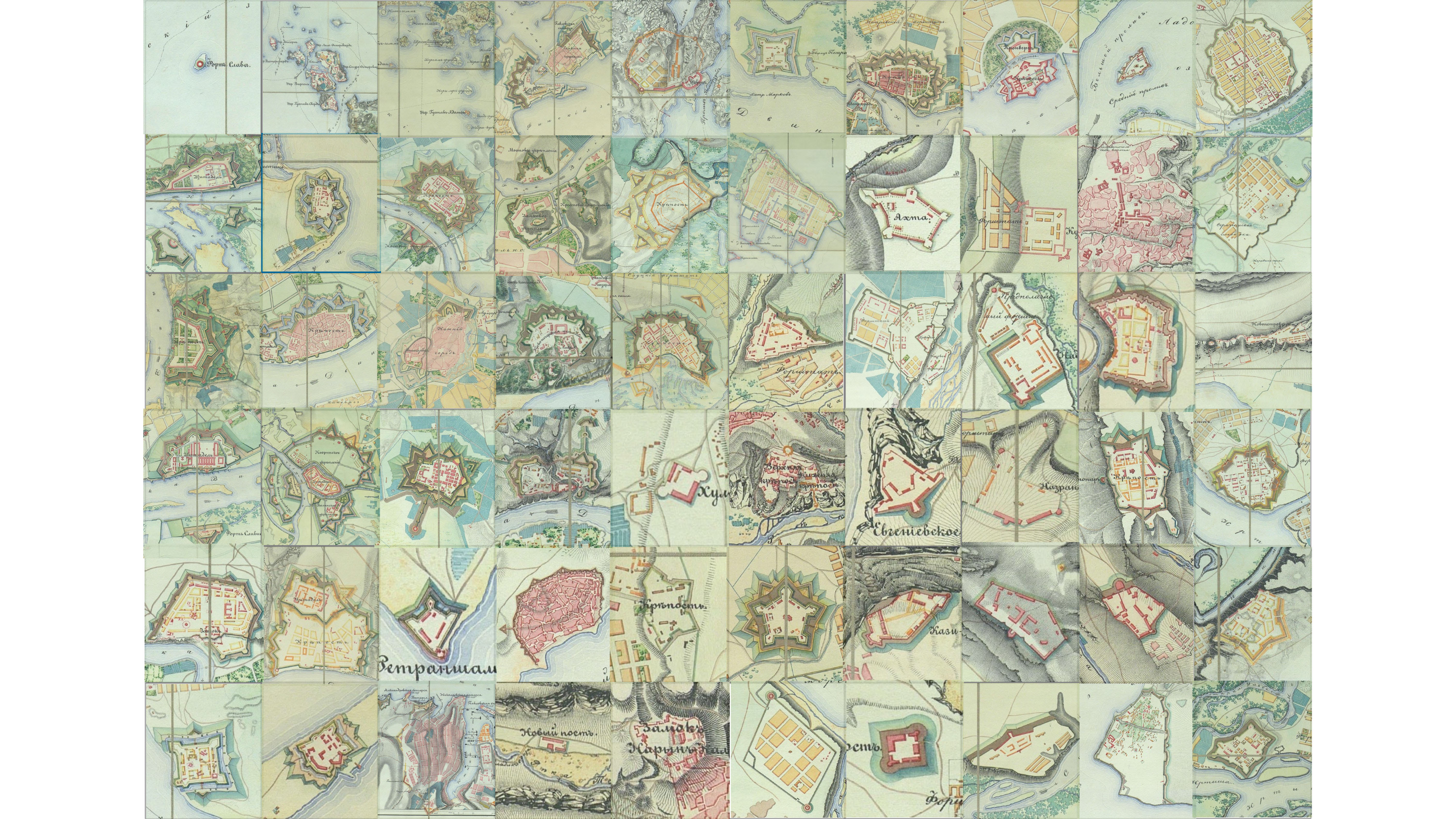
12026-05-19T13:31:10-04:00Anastasiia Pereverten1dee3aa5075817eb04077dbae88a1030d7d4ebb4Fortress mosaic1We often think of fortifications as battle sites, but they have always been much more than that. Fortresses concentrated military strength and projected (imperial) power. They kept some people out and kept others in. This week we are sharing a mosaic of plans compiled from the Atlas of Fortresses of the Russian Empire (1837). This is the empire's network of military installations. From star-shaped bastioned forts to irregular earthworks adapted to the contours of rivers, hills, and coastlines, here are 60 stories about militarized space just waiting to be told.plain2026-05-19T13:31:10-04:00Anastasiia Pereverten1dee3aa5075817eb04077dbae88a1030d7d4ebb4
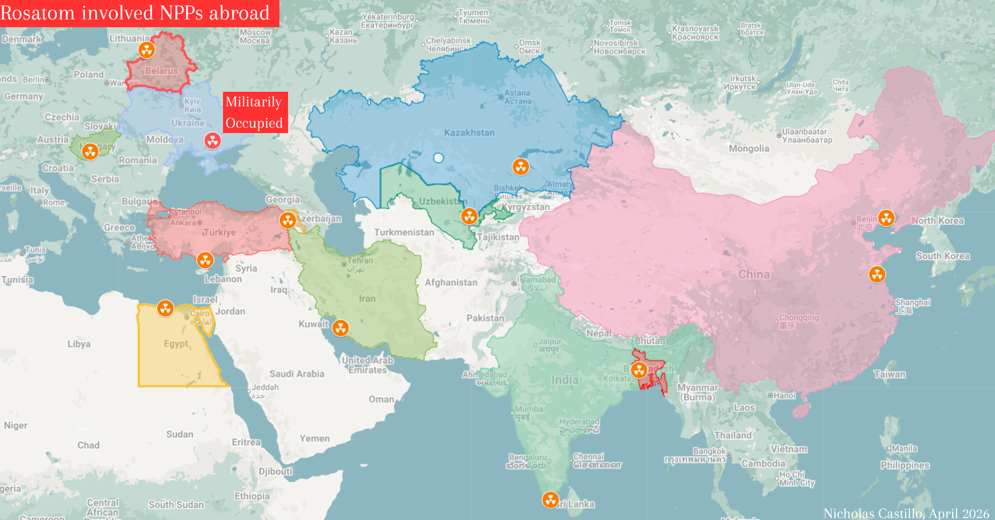
12026-05-19T13:31:50-04:00Anastasiia Pereverten1dee3aa5075817eb04077dbae88a1030d7d4ebb4Rosatom plants abroad1Meet our first guest mapmaker! Nick Castillo is a graduate student at the Davis Center studying contemporary politics. In this map - part of a talk on the legacies of Chornobyl - Nick explores the expansion of the influence of Russia's Rosatom corporation in the international nuclear energy landscape. While several European states moved to sever ties after the 2022 full-scale invasion of Ukraine, a select few Kremlin-aligned states across Europe, Africa, and the Middle East went in the other direction. Their relations with Rosatom figure prominently. The sites range from the militarily occupied Zaporizhzhia Nuclear Power Plant, to Armenia's Metsamor Plant (currently undergoing renovations by Rosatom), to plants in China and India that are still under construction.plain2026-05-19T13:31:50-04:00Anastasiia Pereverten1dee3aa5075817eb04077dbae88a1030d7d4ebb4